Wednesday, 18 April 2012

Wellness M.A.N.T.R.A.


Set in the heart of Noida at Sector 18, Spa Mantra is an oasis of relaxation and rejuvenation. Mantra offers Health spa & Beauty salon facilities with state of the art technology. It is spread over an area of 3,000 sq ft. It consists of a Unisex salon and separate spa sections for men & women.

Spa situated at second floor has rustic décor with a special emphasis on natural elements like wood, stone, water and plants to soothe and relax a stressed mind. There is the sound of waterfalls all around. 

Treatment rooms have been designed on themes like wood-age, Metal-age, stone-age and modern age. Veneers, handmade tiles, cross sections of tree trunks and wall papers have been used on partitions and walls. 


The lighting is all diffused in the ceiling coves. Color changing LED’s have been used to create variety of effects. 


The focal points are the faces of Buddha which can be seen in abundance at strategic locations. The soothing sounds and vibrations of the mantras have a creative transforming effect on the mind, body and spirit. 

The Spa is resonating with calming vedic chants in the background helping the positive energy to actually flows into the user.

Combining age-old wisdoms with modern know-how, we have created a truly unique space that serves as a centre for relaxation, healing and well being. 

More pictures are available at:
https://www.facebook.com/media/set/?et=a.413500453403.196000.26686933403&type=3

Note: All the content posted in this article are the intellectual property of Vivea-Viveck Vermaa Architects unless specified otherwise. Any unauthorized use of these shall be violation of copyright.   https://www.facebook.com/media/set/?et=a.413500453403.196000.26686933403&type=3

Tuesday, 17 April 2012

HOUSE IN ARAVALIS

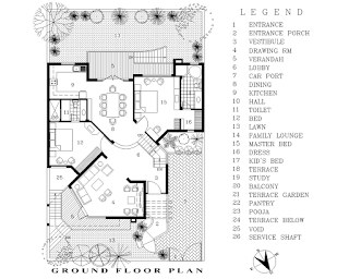
The House is situated in Faridabad, adjoining Delhi on a plot of 350 sq yards. The house has a basement & two floors with total floor area of three thousand five hundred sqft. The inhabitants consist of two brothers mid 30’s and their family consisting of a wife and two kids each and parents in the sixties.

NOTIONAL CONCEPT

There are three aspects to every human being, they are represented by Body, Mind & Soul. While body requires physical comforts, mind requires knowledge and the soul requires freedom. Harmony and balance between all three aspects are required to attain harmony & happiness in life. To achieve this harmony is also required between the house and its inhabitants. The notion behind the design of this house was provide this harmony & balance by following:

  1. Providing physical comforts by carefully analyzing and fulfilling the space requirements based on the lifestyle of the inhabitant and providing climatic comforts.
  1. Providing an environment conducive to the mental growth by carefully analyzing the various aspects like aesthetic values, the journey in life, the fondest memories, the achievements etc. of each and every inhabitant and transposing those in their personal spaces.
  1. Provide opportunities for freedom of soul by analyzing various aspects of the nature & personality traits of each and every inhabitant. Various opportunities have been created within spaces and design elements which establish dialogues with the inhabitants.
RESPONSE TO SITE

The plot is situated on Aravali Hills and the terrain was consisted of big rocks of Quartzite. The contours of the site had a variation as great as 3 meters between highest and the lowest levels. 

The house has been designed so that minimum cutting & filling was required, keeping the natural contours of the site intact. The split levels in floors, the form of the structure is a response to the natural levels of the site.

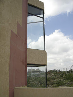
It’s like a jigsaw puzzle that fits perfectly on the natural rocky terrain, thus establishing a connection to the site. The form of the house reflects the pointed edges of the rocks. To keep the focus on the form and to draw the distinction between the nature and the man made, plain textures (surfaces and materials) have been used. The use of earthy colors and stone cladding is again intended to establish a connection with the surroundings.

RESPONSE TO CLIMATIC CONDITIONS

To avoid excessive heat gain in summers, areas like bathroom & kitchen etc. have been placed in south and south western zone, habitable rooms in this zone if any have been protected by deep verandahs, pergolas and louvered screens. Also present are cavity walls & sunshades. The roof areas have been insulated. The glazing areas have been minimized.

The verandahs and pergolas etc are so designed that while they prevent sun from penetrating in summers, they allow sun in winters from south side.

There is cross ventilation throughout the house. The triple height staircase lobby placed in the centre of the house sucks the cool air from lower floors and circulate it throughout the house.

SPACES

After entering the plot through the main gate, one has to go through a series of spaces to reach the main entrance door of the house. These spaces include a series of spiral steps with sloping walls on both sides leading to the main entrance porch which is covered with a pergola on top. 

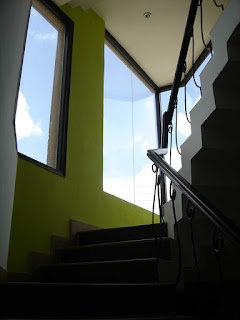
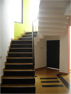
The entrance lobby is a double height vestibule also housing the staircase. This core forms the centre of activity in the house. This connects as well as separates the formal and informal areas in the house. The mid landing of the staircase at two levels is used for various activities like leisure, study, music etc. 

It has big glazings on three sides offering the panoramic view of the hills, grounds and sky.


The floors have been broken into various levels. 

Semi covered spaces in form of verandahs are provided which forms a link between the interior and the exterior. All the areas open into semi covered spaces which in turn open into the lawns or terrace garden.

All spaces that have been generated are fluid in nature, flowing and merging into each other. Corners, nooks, skylights, platforms, levels etc. have been created throughout the house, helping the inhabitants to create experiences & establish dialogue with the building.

The house has open ended design. It’s like a tree growing and transforming with time. All the spaces are flexible and have ability to be transformed with the needs.


Note: All the contents posted in this article are the intellectual property of Vivea-Viveck Vermaa Architects unless specified otherwise. Any unauthorized use of these shall be violation of copyright.

Monday, 16 April 2012

Essentials of a beauty salon design

To start the designing of any salon or spa, it is utmost important to understand the business plan, the kind of services that will be provided, the target audience, the revenue generation potential and the brand positioning. All these points if clearly understood; interpreted help in creating an interiors which is appropriate, highly customized, sensitive to the needs of both clients and the business, in sync with the brand positioning.  Thus a holistic approach to the design is the basic necessity.

Once all these points are understood, we need to elaborate the various components of the salon. These components are as follows:


Entrance/reception area: It’s the first point of contact for the customer and the salon. It should be welcoming. A reception desk cum cash desk should be positioned in such a location that the receptionist can see all the movement happening in salon.  There should be a waiting area for clients.  There can be a retail space/cabinet in the reception area which is placed at such a location which is highly visible and controllable by the receptionist. The signage is an important part , the logo panel should be placed at a strategic location preferably behind the desk. A signature wall can also be created displaying the signature elements.

Styling Area: It’s the area where various styling services are provided. Styling stations can be placed in various permutation and combinations depending upon the space available. Each styling station has a styling chair and a mirror in front.  The Styling area can be unisex or gender based. Another important part of styling area is the back wash area where hair are washed.  
It is very important to create a place where shampoos, conditioners, fresh towels and used towels are placed for easy access.

Pampering services include pedicure, manicure , head spa etc. This area can be semi-enclosed for restricted visibility.

Beauty Rooms: These rooms are used for facials, waxing, massage etc. The room should have a facial bed with space all around, a basin, a storage cabinet, a full height mirror etc. The environment should be relaxing and soothing. It’s a good idea to do sound proofing as much as possible. The combination of various lights like cfl downlighters, spots, cove lights and LED’s can create various combinations.

Utilities include wash rooms, pantry, staff area and storage areas.

There are various steps involved in the process of design of a salon. The First step is to create a program of areas/requirements. The next step is to create a design concept along with a layout plan. It also includes creating 3d models and simulations. This whole process takes around 7-10 days. The next stage is to create drawings and specifications for execution and that takes around 7 days. So the total time taken to design a salon is around 15 days.

The programming for every salon is quite unique; complex with various independent as well as overlapping functions. Each and every space has its own sanctity & functioning. A relationship between these independent spaces and the site needs to be defined very clearly. In addition we need to evolve a visual / spatial language strong enough to create a brand identity. Once all these macro level issues are taken care of, there will be micro level detailing issues which require a very careful handling as they are crucial in creating a difference between an average or a high class interiors.

To create an appealing salon following things play an important role.

Lighting plays the most important role in creating an appealing salon. Down lighters placed in technically correct positions in working areas, indirect lighting thro’ coves or uplighters, spot lights highlighting the visual elements and products and LED’s creating dim light areas..all these light elements used properly create wonders for the salon appeal.

 The choice of finishing material plays an important role. The materials should be well coordinated with each other as per the concept design and should form a part of the larger picture. The materials should be maintenance free and easily cleanable and shouldn’t look shabby after few days.

Visual elements communicate with the customers and establishes a dialogue with them. Signages, logo, posters, signature wall if strategically placed adds to the visual appeal to a great extent.

Identity markers are very important as they provide a uniqueness to a salon.  Reception desk, styling stations, salon furniture, display areas, ceilings, handles, Light fixtures, all create a signature appeal.


 Detailing is of prime importance, which require a very careful handling as they are crucial in creating a difference between an average or a high class interiors.

Note: All the content posted in this article are the intellectual property of Vivea-Viveck Vermaa Architects unless specified otherwise. Any unauthorized use of these shall be violation of copyright.   

Sunday, 15 April 2012

C.R.U.N.C.H.


CRUNCH is a Lifestyle Fitness Facility offering state of the art Fitness Center, Slimming and Spa services with an objective of making the community health conscious and Fit for life.


It is situated in one of the up market shopping Malls. The objective was to create a high end gym with all the latest facilities.


The most prominent feature of design is its Ambience. The theme chosen for the gym was cosy & monochromatic with beiges and browns. All the materials like flooring, wall papers, fabrics etc. were chosen around this theme, in addition to having their own practical utility.


There are five sections in the gym :

1. Slimming
2. Strength 
3. Weight
4. Cardio
5. Spa


As the site offered a twenty two feet high ceiling, a mezzanine floor was created where separate spa facilities for ladies and gents have been accommodated.

The cardio zone was created on the front periphery of the Mall and the whole opaque façade of the Mall was replaced by transparent curtain wall to create more visibility from the outside. Another continuous glass façade was erected towards the atrium of the mall as another step to enhance visibility.
All the treatment rooms in slimming area are soundproof with individual music and weather control. Two rooms have attached shower & steam rooms. All rooms have multiple lighting options for supporting multiple activities.

The Gym is centrally air conditioned. It has CCTV & Bio Metric access & security systems at critical areas.

More pictures of this project are available at

Note: All the pictures posted in this article are the intellectual property of Vivea-Viveck Vermaa Architects. Any unauthorized use of these shall be violation of copyright.